October 14, 2024
If you’ve ever listened to public radio’s “Marketplace” with Kai Ryssdal, you may have noticed the songs they play when they “do the numbers.” On days the market is up, it’s “We’re in the Money.” On down days, they cue up “Stormy Weather.”
These musical accompaniments are a way to acknowledge the emotion listeners may be feeling when they learn whether markets have spiked or sunk on any given day. Ultimately, it’s lighthearted stuff. But it’s one example of how the media uses all sorts of tactics to play to your emotions and make the financial market news more compelling. Some of these ploys are more insidious than others.
Consider, for example, how the media discusses market volatility using magnitude versus percentage—a point Wall Street Journal columnist Jason Zweig has drilled down on. While both ultimately describe the same thing, magnitude—the number of points a given index rises or falls—is often more sensational.
For example, on Monday, August 5, 2024, the Dow Jones Industrial Average fell 1,033.99 points from the previous week’s close. To many people, that number sounds big and scary, quickly grabbing their attention. And that’s what news sources often want to do.
Unfortunately, this number doesn’t account for the index’s starting point. On August 2, the Dow Jones closed at 39,737.26 points. Divide 1,033.99 by 39,737.26, and you’ll discover that this roughly 1,000-point plunge represented a 2.6% drop in the index. That’s a sizable one-day decline, but we’d wager it sounds far less scary by that measure.
“By focusing on the magnitude, rather than the percentage, of price changes, news organizations…make markets feel more newsworthy, and volatile, than they are,” says Zweig in his newsletter, “The Intelligent Investor,” pointing out his own publication is often guilty of the same.
Why Magnitude vs. Percentage Matters
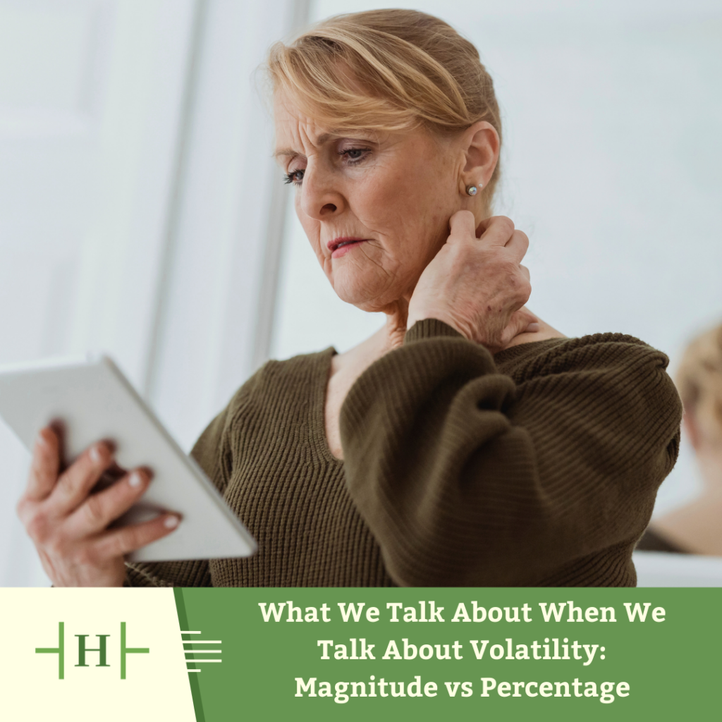
Unfortunately, as human beings, we are prone to behavioral tendencies and mental shortcuts that don’t always work in our favor. When we see or hear information—especially if it comes across as alarming—we may fixate on it in counterproductive ways.
For instance, how information is presented can have a bigger impact on how we feel about it than the facts themselves. This framing bias is what convinces you to see a glass as half full or half empty. In this case, seeing a 1,000-point drop in a market index might lead you to panic and sell investments, or at least feel nervous about sitting tight. It might help your emotional and fiscal well-being to remember that “big” point drop is also a much smaller 2.6% decline.
So, what’s an investor to do? First, recognize the role your emotions play in processing this kind of information. When you encounter what seems like a scary statistic, ask yourself whether it’s actually that scary. Is the stat giving you all the information you need? Is it presented out of context or hiding anything? Is it being used to sensationalize a story to snag your valuable attention? If so, it may pay to be suspicious of it.
Once you understand how your biases and information presentation can work against you, you can focus on the most important thing: The market has always eventually risen over the long-term. Sticking to your long-term plan can help you take advantage of this historical pattern. Case in point: After that early-August 2024 decline, the markets roared back; within a week and a half, the Dow Jones Industrial Average recovered the ground it had lost, as did other U.S. market proxies, including the S&P 500. Investors who stayed the course quickly recouped their losses—and then some.
If you ever have questions about the market and how to make best use of it to achieve your financial goals, please drop us a line.